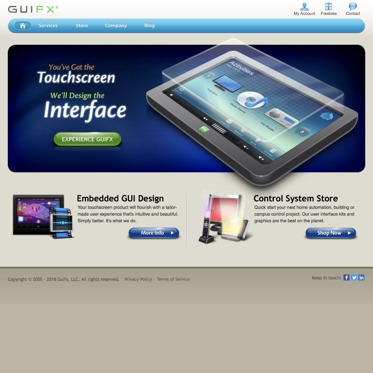
Pioneer
Founded in 2000, Guifx pioneered touch screen graphical user interfaces for home automation and embedded systems.
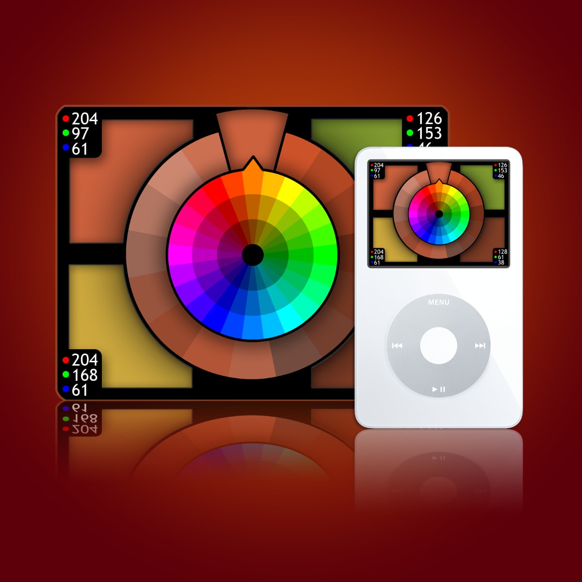
Innovator
Koloroo began as a first-of-its-kind iPod widget for interactively exploring color schemes generated by math.
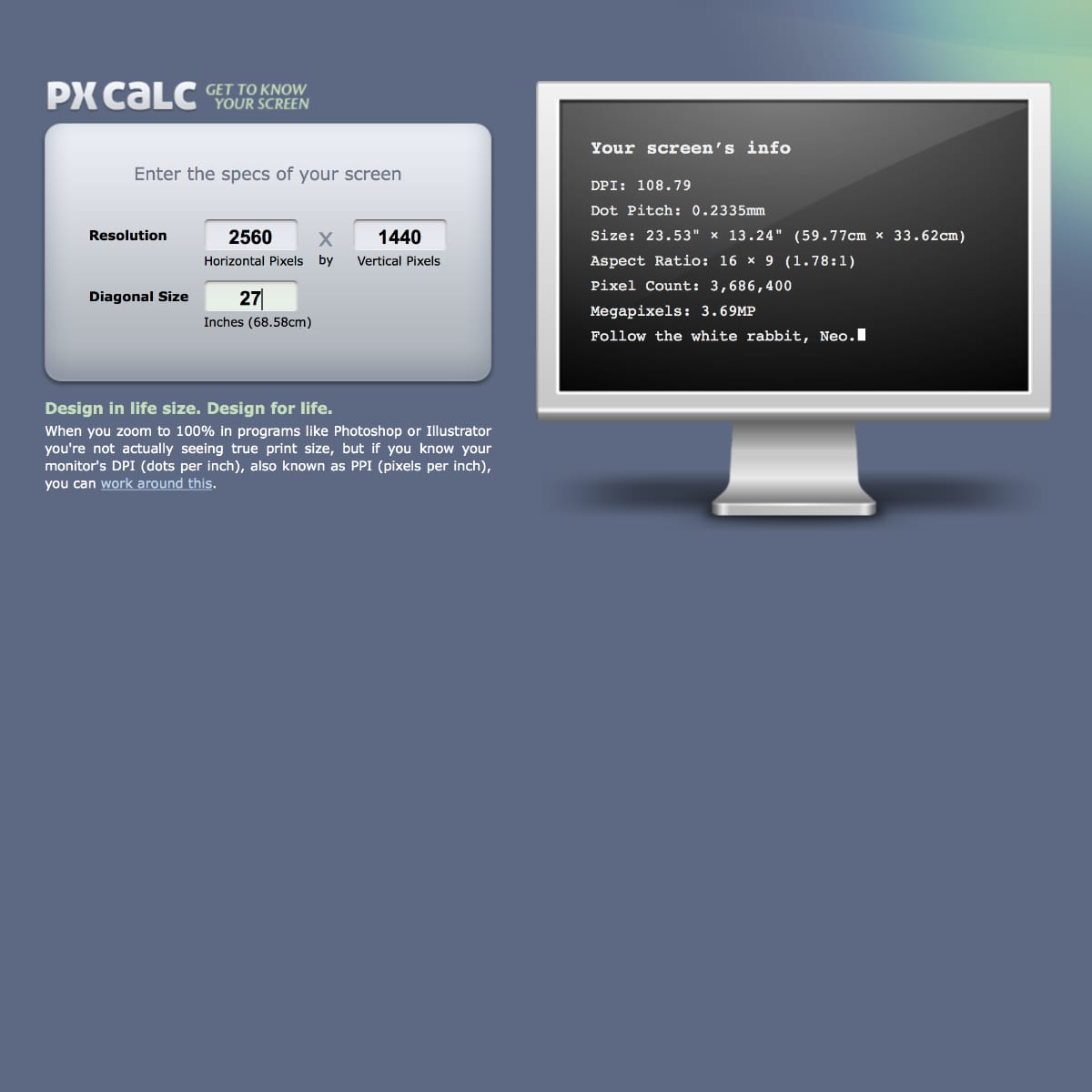
Eagle Eye
After writing an article on designing to scale, the pixel calculator was built to assist others design in life size too.
Educator
“Of the various events at CES, your presentation was among the top 3 things I experienced at the show.” — Allen K.
💬
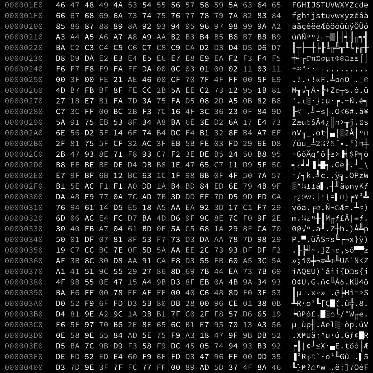
Hacker
… but always for good and not evil! From untangling corrupt file headers and developing elegant password retrieval tools to diagnosing, coding, and injecting firmware and I/O patches.
[email protected] $ rd -C -s 0x3800

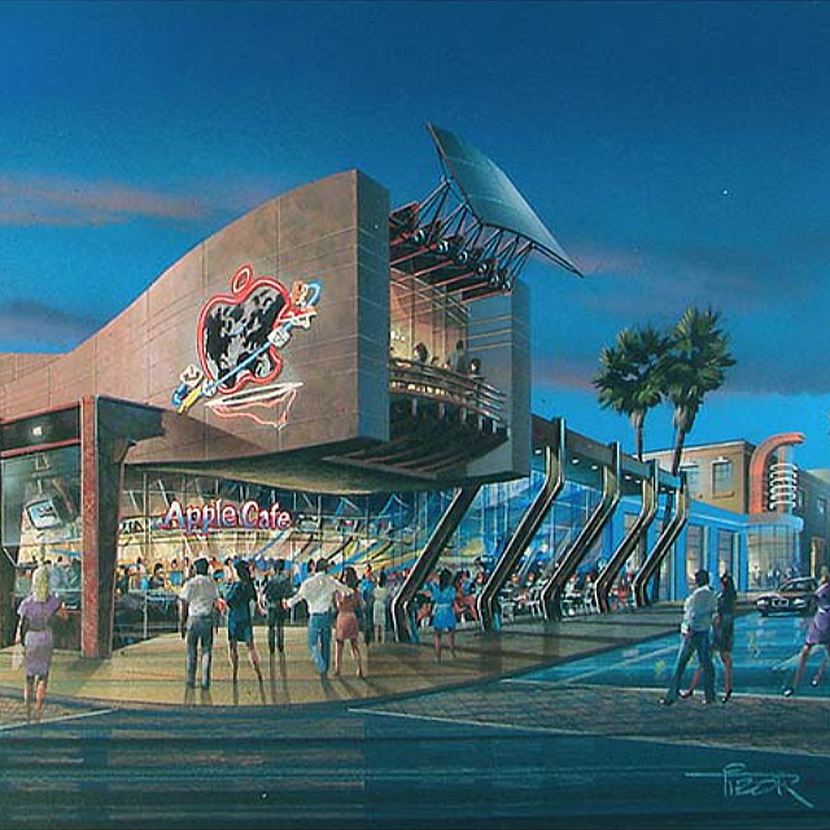
Art Lover
I especially love concept art. Included in my collection are hand-painted renderings of the Apple Cafe concept which was aborted because Apple was, believe it or not, deteriorating in 1996.
♥️
I’ve had a number of different color wheel programs, but straight away this is the nicest, quickest, and aesthetically the best interface.
Andrew M
Once again you and your team did an excellent job!!!
I look forward to working with you more!
Pete B
Do you have a book or manual you’ve written on GUI design? I base everything I do on four or five recommendations of yours — with success! Thank you!
Bogdan D